Continued thanks to Amazon for adding all-text bold capabilities to Kindle E Ink readers and the related iOS app.
Jeff Bezos and friends still are not helping out owners of Fire tablets—or book-loving Android users—with a bold option for ebook text. But the Kindle and iOS-app changes are some progress.
Even so, the need for the bold option is far from over, on other apps and other platforms. Not for some K-12 students. And not for millions of other Americans with contrast-sensitivity challenges, especially many older people.
The most popular browser, Chrome, lacks an all-text boldface option except through the High Contrast plug-in and others from the Chrome Store. Alas, the plug-ins are far from a full solution since they can wreak havoc on graphics. What’s more, the High Contrast Text option within Settings doesn’t do the trick on typical text. Nasty contrast issues remain.
Of course, the lack of an all-bold option via Chrome is just one example of the need for Android to be more accessible.
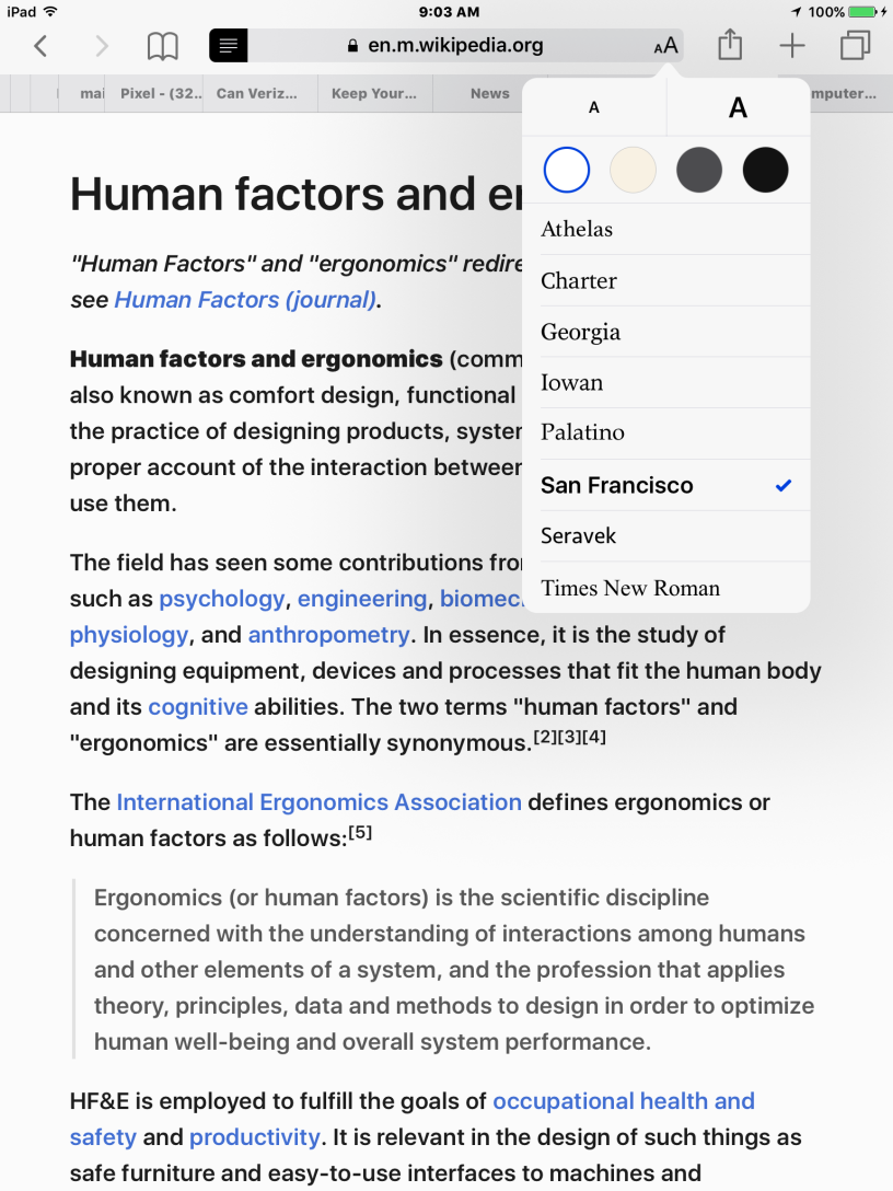
The real solution is an accessibility fix at the level of the Android operating system, complete with an accessibility mode. Look at the screenshot above from my iPad, showing what Google’s rivals over at Apple have done with iOS. Programs such as the Safari browser let users call up the accessibility mode with a tap on a hamburger and almost instantly change not only the type style but also the font size and the coloring scheme. Apple truly baked the mode into iOS. Google needs to do the same with Android and Chrome.
I know. Within Android’s accessibility menus in Setup, you can alter the “display size” and “font size” and make other tweaks, such as displaying white text against dark background. But the all-text bold option isn’t there. Needless to say, I’d also welcome accessibility improvements in Opera and Netscape, for all operating systems.
Why are developers and coders so oblivious to these needs, whether we’re talking about ebook apps, hardware, or Web browsers? Could it be that most of them are on the young side? Or are designers part of the problem? Or simple corpocratic stubbornness? I remain baffled why TeleRead and others had to beg Amazon for the all-text bold option for years?
Yes, I’m gratified that Amazon finally got the message and extended bold from the Kindle to the iOS app. But face it: this is just good business (even if accessibility issues most likely will count less legally than before with Trump’s trogs setting the regulatory tone for D.C.).
The easier it is to read or perform any other activity, the more likely people will be buy Kindles, Chromebooks, ebooks and the rest.
Google, of course, might protest in regard to the Chrome browser: “The proposed accessibility mode will encourage people to focus on text. But how about ads? That’s where the money is.”
Agreed. More than ever, text will be the main show while people use the much-needed accessibility mode. But they will still do lots and lots of browsing without the mode in place at the time and be more receptive to the ads they see along the way.
Smart newspapers, magazines and others will understand the stakes here. If publishers want the Web to reach its full potential—and be less circus-like—then even readers without special accessibility issues need to be be able to enjoy a breather from the distractions around them. They might even be less likely to use ad blockers.
If you care, why not write jeff@amazon.com in a civil way to tell him to bring all-text bold to the Android apps and the Fire tablets, including the Silk Browser—the shareholders will appreciate it. As for Chrome, you can help Google with some feedback here. Mention not only Chrome and the Android OS but also Google Play Books and anything else you’re moved to complain about. Speak up! We got some major results with Amazon. Keep at it! Don’t give up now. With more and more books viewable on the Webs in whole or as excepts, it would be wonderful if publishers, not just users, also took an interest in this matter.
Caveat: I’m writing the above based on the software I’m now running—in the case of Android, just 6.0. If anyone knows of a new all-text boldface option Google or others have added, please let me know.
A library angle: Why the devil does OverDrive’s new Libby software for library patrons still lack the bold option found in at least one earlier OverDrive app? I asked the company about that several months ago. No action. Librarians and patrons alike need to be vocal. Aren’t libraries supposed to be about accessibility? You can speak out on OverDrive’s Facebook Page. Of course, if OverDrive beats me to the punch and acts on its own without many people speaking up, then terrific!
The screenshot: Yes, the ergonomics page is from Wikipedia.

As for web browsers, consider the use of custom style sheets that override aspects of the web site being browsed. Here is a list of resources for Safari on Mac: https://www.google.co.uk/search?q=safari+extension+css+override&oq=safari+exten&aqs=chrome.0.59j0j57j5j62l2.10904j0&sourceid=chrome&ie=UTF-8
There are similar options for Firefox and Chrome.
LikeLike
@Frank: Good info, thanks! But this is not the solution for the typical user.
LikeLike
@David: It may not be as hard as you think. If you can download a stylesheet for your web browser, installing it is pretty simple. Here’s a site that will generate a low vision stylesheet for you to download: http://people.ds.cam.ac.uk/ssb22/css/#inst
Note the installation instructions at the bottom.
It’s not perfect due to browser issues but it is do-able for most folks and lighting this candle may serve us better than cursing the darkness.
LikeLiked by 1 person
Frank: Many thanks. I might try it myself, and I’m confident that some other members of the TeleRead community will do the same; but this still isn’t for the masses. I still hope people will speak out! Excerpt from the URL:
Google Chrome: You can use an extension like userScriptCSS. In Tools/Extensions/userScriptCSS set the regexp to .*, paste in the CSS code, and press “Save”; it applies to newly-loaded pages.
If you use dark backgrounds, you might still have to put up with a white background during page loads
You might get better results with other browsers—if Firefox is too much for an old PC then try Midori
Or you could try running Chrome with Web Adjuster
e.g. on Linux set up a /usr/local/bin/x-www-browser script to do python (full path to adjuster.py) –browser=”google-chrome –proxy-server=localhost:28080 $*” –real_proxy –delete_doctype –address=localhost –headAppendCSS=http://(URL of stylesheet goes here), although SSL sites will need domain-rewriting
A white background will still show in Chrome’s blank page and new tab screen etc (so you might want to set a homepage); when navigating within sites it should happen rarely if ever. (If reloading already-visited pages, clear the cache.)
LikeLike
You know, it’s interesting to consider that fonts can be a lot more meaningful than people think.
LikeLike
@Chris: Meaning’s great. But sometimes designers can get too much into it. Here’s to the availability of readability options for people who need them!
That said, I really enjoyed the linked article–thanks. Great observations on the role of typography in the related political and cultural battles! Let’s hope that Trump never feels free to use blackletter, even if Steve Bannon would probably love it.
LikeLike