Remember all the howls from fan boys when TeleRead and others complained that Amazon was using misleading photographs to ballyhoo its latest basic model?
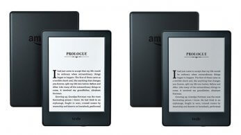
Well, for once, Amazon listened. As you can see from the above comparison from lesen.net, Amazon is now relying on a different photo, which tells the truth: that the $80 Kindles have a gray screen background rather than a white one. This darker color reduces the readability of the actual text.
At least one press page still shows a white screen. But I assume that Amazon will correct that in time.
On the positive side, Amazon now says: “Planning on reading in low-light settings? Kindle Paperwhite, Kindle Voyage and Kindle Oasis offer a built-in light…” Presto! Now people will stop buying basic Kindles while thinking that they’re getting front lighting, and the number of one-star reviews from disappointed customers will fall off.
Amazon’s ‘reads like real paper’ hype
In truthfulness, have Amazon ads now reached absolute nirvana in regard to screens?
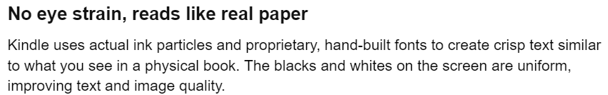
Well, the just-mentioned changes helped, and kudos to Amazon for them. But the company is still guilty of of a different kind of hype—when it says, “No eye strain, reads like real paper.”
The “No eye strain” I’ll buy. But this isn’t paper unless, as my wife points out, it’s gray paper. Amazon goes on to talk about “crisp text similar to what you see in a paper book.” No! The contrast ratio between text and background still isn’t sufficient to merit that description. The many older people with contrast sensitivity issues, as well as some K-12 students with disabilities, may still experience problems reading the text. In my 60s, I do. So does Carly.
At least we know what’s going on. Many customers may blame their difficulties on their eyesight alone rather than also on the inadequacies of Amazon’s E Ink products. Even frontlighted models can present contrast problems for some customers.
The ultimate solution
Here’s the ultimate solution, beyond Amazon and competitors cutting out the paper comparison.
In conspicuous places in ads for E Ink ereaders, Amazon and the others should remind buyers with this caveat or variants: “Readability of Kindle screens may vary by lighting conditions and by your eyesight.”
Duh, it sounds obvious. But keep in mind the classic “Your mileage may vary” of the automobile advertisements. People just might forget that even with lights near by, conditions may not be optimal. While this sounds excruciatingly elementary to veteran ebook users, it isn’t necessarily to other customers.
The more honest photos help mitigate the “reads just like paper” problem a bit—but people may remember the catchy phrase and repeat it to friends without the photos nearby.
Regardless of Amazon falling short of perfection, however, we’re still talking about progress. Also keep in mind that Amazon competitors such as Tolino have committed similar sins
Now—if I can get Amazon to back off in another way and acknowledge that it needs to let people switch on all-text bold or maybe use even a bold-control slider.
Could marketing zealots be one reason way Amazon won’t offer all-text bold as an option for Kindle users? Because it wants you to think that its screens are just “like paper”? I can read paper just fine without boldface. Carly and I and plenty of others, on the other hand, can’t read Kindle screens optimally without boldface.
Reminder: I myself am often a Kindle fan boy, as shown by TeleRead’s purchase of $50 Fires tablets for several of my writers to encourage them to write about this device (significant from a digital divide perspective). But I’m going to call the shots as I see them.
(Via The eBook Reader and The Digital Reader)
