Right now I’m reading Gary Shteyngart‘s Little Failure, which I’ve checked out through the OverDrive service of the public library here in Alexandria, Virginia.

What a timely book! Little Failure reminds me how horrific the old Soviet Union was for many of its inhabitants, er, victims. People lived in dread of exploding TVs. That’s how bad life was. And here we have an American presidential candidate for whom Vladimir Putin, a KGB alum nostalgic for the old Soviet days, is rooting. Ouch.
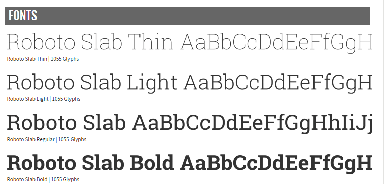
Still, with all the horrors and ironies rendered in brilliant and compelling English, Little Failure is a pleasure to read. I’m enjoying it all the more with the Roboto Slab font displayed in bold on my Samsung tablet.
A version of Roboto, the Roboto Slab font is easy and legal to download for free—just go here. Works great on my Kobo Aura One as well (instructions for installing custom fonts on the Aura One). I had to zap the non-bold incarnations to see bold, but I succeeded.
If you own an Android phone or tablet, you can carve out a /font directory or a variant for new fonts if it isn’t there already. Locations may vary from reading app to reading app and from device to device. Here are links to font installation guides. If you own an iPad or iPhone, you can get Roboto Slab going through apps such as Marvin. I’m still working on that one.
Would that the corpocrats at Amazon halt their Putin act and let us install Roboto Slab and other custom fonts on Kindles (and ideally Fires and Kindle apps, too), the way they did in the past. I suppose it’s too much to ask Amazon to include Roboto Slab among the Kindle choices. But perhaps Kobo and other Amazon rivals can consider Roboto Slab. Same for app developers. I’m delighted that eReader Prestigo, which TeleRead Editor Chris Meadows just reviewed, comes with Roboto Slab.
From the Font Squirrel site:
Roboto has a dual nature. It has a mechanical skeleton and the forms are largely geometric. At the same time, the font features friendly and open curves. While some grotesks distort their letterforms to force a rigid rhythm, Roboto doesn’t compromise, allowing letters to be settle in to their natural width. This makes for a more natural reading rhythm more commonly found in humanist and serif types.
Meanwhile props to Roboto developer Chris Robertson. His work is at least several years old, so I’m late to the party, but better late than never.
Your own favorites?
Regardless of my enthusiasm for Roboto Slab, I’m still keen on other choices, such as Rockwell. What are your own favorites and why? I like Roboto Slab for the reasons mentioned on Font Squirrel. Beyond that—or maybe related to that—it renders individual letters clearly and at the same time lets me read words a little more easily than I would otherwise. Roboto Slab flows.
A natural question: Why don’t academics care less about ebooks vs. paper books—we know what the eventual outcome will be—and more about ways to make E more readable. No small part of that is to settle on the right type styles for the right people. As I keep saying, ebook tech is like eyeglasses. One device, one app, one typestyle, won’t work for the entire cosmos.
Related: More Roboto download possibilities. My gratitude to Google, Robertson’s employer, for making this one a freebie.

Times New Roman.
If it ain’t broken, don’t fix it.
LikeLike
@Gary: Fair enough. But I myself do best with boldface, and Roboto Slab bold looks better to me and is an easier read than Times New Roman bold. Hey, what works for you might not for me, and vice versa. I suspect a lot of people would stick to Times New Roman because they’re used to it. Still, Roboto Stab might be worth a try for many.
LikeLike
Droid Sans, also known as FBReader’s default. I didn’t know I could change it until I read this and looked it up.
LikeLike
@Thomas: Great. Let us know what happens when you experiment. Works fine with my FBReader Premium.
LikeLike
Helvetica. I like it because it’s simple and clear, easy on my senior eyes.
LikeLike
Try Crete Round. I find that it’s a little bit thicker than Roboto Slab, so it’s easier for my eyes. Especially on high resolution screen. I use both fonts regularly, though.
LikeLike
@Hapmas77: Yes, Crete Round looks like another good one–thanks for the suggestions. https://www.fontsquirrel.com/fonts/crete-round
LikeLike
Not yet decided, but my preferences are in this order (Reader Moon+ pro)
Google Literata
LibreBaskerville
Vollkorn
LikeLiked by 1 person
I started with eBooks with the first Sony eReader. On all the generations of Sony devices I purchased I used the Amasis font.
Doing a little research, the Amasis font was designed by Ron Carpenter – https://www.fonts.com/browse/designers/ron-carpenter
When moving away from the Sony eReader to Android tablets, I switched to a different Ron Carpenter font called Calisto, specifically the Microsoft implementation.
Microsoft included it with many of their products – http://www.microsoft.com/typography/fonts/font.aspx?FMID=931
LikeLike