For years, TeleRead complained of the lack of an all-text boldface option in Kindles and Amazon e-reading apps.
Amazon finally listened to us and others. It added bold to E Ink Kindles. If I’m not mistaken, bold is also in available in the latest Kindle for PC app (mine is out of date).
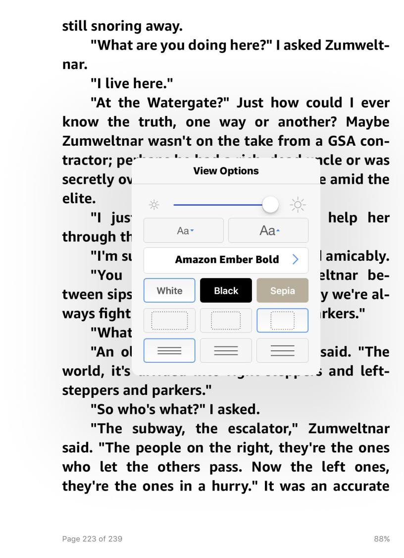
Now, “based on feedback from customers,” Amazon has finally gotten around to adding Ember Bold for the iOS incarnation. Looks great on my iPad, and, yes, it’s also available for iPhone owners.
Download the latest incarnation from Apple’s App Store.
Still on my wishlist:
–Other fonts in all-text bold. Kobos allows bold in different fonts and even let you adjust the font weight with a slider.
–Boldface on the Kindle app for my Android phone. I assume that’s on the way.
–Also a boldface option on Fires, if it isn’t there—I’ll update this post if it is.
All-text bold is helpful since even LCD screens, not just E Ink ones, may not offer enough contrast for older people.
What’s more, with all-text bold, you can crank down the brightness, stretch battery life, and reduce eye strain. That trick will help people with all levels of vision.
Oh, and don’t let the large text scare you. You can reduce it.
Nice going, Jeff Bezos! And thanks also to Jamie LaRue of the American Library Association, who has been among our allies in our “bold” crusade. Props to others, too, including Nate Hoffelder of The Digital Reader, Len Edgerly of the Kindle Chronicles, and Barry Marks of the Kindle Korner list.
(Big thanks to Michael Perry for the tip.)

I just checked, and Ember Bold is indeed included in the latest Kindle for iPhone.
LikeLike
Thanks. I’d already determined that otherwise, but it is still good to get independent confirmation.
By the way, I’m really enjoying the bold. At the same time, I still wish a Kobo-style slider existed to vary the font weight. The existing bold actually overdoes it a bit for me. Still, this is definite progress.
LikeLike
I’ve used the all bold on my Kindle and it’s pretty good. It allows me to decrease the front size by a peg while retaining readability.
I wonder Kindle will ever have the option user being able to toggle between ragged right and full justification. The iBook and Kobo apps let the user choose. I have not purchased a few titles were the Kindle is hard coded for ragged right margins
LikeLike
@Greg: Glad that Amazon’s bold is working out for you. As for ragged right, are you running the most recent firmware?
https://www.amazon.com/gp/help/customer/display.html/ref=hp_left_v4_sib?ie=UTF8&nodeId=202065490
From Amazon:
“Ragged Right Alignment: You can now read using left-aligned (ragged right) text instead of justified (aligned on both left and right margin). This new alignment option can be selected from the Display Settings (Aa) menu within Kindle books that support Enhanced Typesetting. On the Kindle eBook Store page, look for “Enhanced Typesetting: Enabled” in the features list.”
Limited to KFX format, apparently. More at:
https://the-digital-reader.com/2017/04/13/kindle-firmware-5-8-9-adds-better-margin-control-ragged-right-yay-improved-format/
LikeLike
I’m on Firmware 5.8.7 so I’ll update when I get off work. I turned my 3G on so maybe it will update itself before then.
I remember the Easter egg in the original Kindle – it was a one way street: you could turn off justified margins, but you couldn’t turn it off if the book was hard coded for ragged right.
LikeLike
One way street confirmed on 5.8.9 update. Unable to justify margins on books hard coded for ragged right. The alignment icon shows justification and toggling back and forth has no effect on the display. Bad Amazon for not seeing this bug.
LikeLike