For years, TeleRead and others pushed for optional all-text bold on Kindle hardware and apps. Amazon’s Ember Bold font at last happened. What a boon to certain schoolchildren, older people and others with contrast-sensitivity issues!
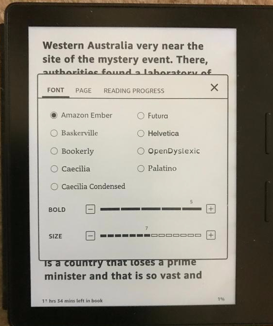
But now Amazon has taken this one step further. It allows five levels of boldness for all fonts via a firmware upgrade, in addition to increasing font-size selections. Check the upgrade page in regard to your device, which may or may not be covered at this point. Here is the page for a download for Update 5.8.11 for my Kindle Oasis.
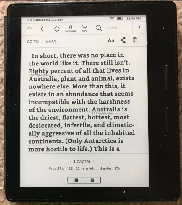
The featured shot above shows the Ember in action after I set it for maximum boldness, which I need. Under this paragraph, you can see the Bookerly font at the boldest level.
 Just as I’d hoped, Amazon added its easy to use bold-level adjustment within the fonts menu. It’s finally caught up with Kobo E Ink devices in that respect even though the adjustment isn’t as precise—you’re limited to those five levels. Just a nit. On the plus side, Amazon’s boldness adjustment works lickety-split, while Kobo’s at times can be pokey.
Here are new features in the upgrade for the Oasis, as Amazon itself described them:
- Bold Control: You can now set the boldness level on all reading fonts for enhanced readability and eye comfort. The new bold option can be controlled from the Display Settings (Aa) menu in books.
- More Font Sizes: You can now choose from 14 different font sizes to suit your reading preference.
- Redesigned Search Results: See chapter headers with in-book search results to help you find what you are looking for.
Other goodies are on the way, at least for the forthcoming seven-inch Oasis. A news release has promised the ability to reverse the dark letters and light background, for the benefit of people with light-sensitivity challenges. You’ll also be able to “increase the size of items like the text on the home screen and library as well as the book icons to make the all-new Kindle Oasis easier to read.”
While the new Oasis with the seven-inch screen will go for $250, these developments are exciting from a digital device perspective, too, since the technology sooner or later will almost surely trickle down to the more affordable Amazon models. I don’t believe in trickle-down economics. I most definitely do in trickle-down technology.
But why the headline’s reference to “Rothman Left Eye V. 2.0”? No mystery there. This week my cataract surgeon, having done the right eye, polished off the left.
Even as a cyborg of sorts, with reborn eyes, I still benefit from bold, and more importantly, the surgery is not within the means of all people—both inside and inside the U.S. So, Jeff, keep up the good work on boldness and other accessibility issues. Waiting for your to offer text to speech again for nonblind users of Kindles. Your Fires have it. Why not Kindles? Or is that on the way? And how about five-level boldness for Fire tablets and for apps? Whatever the case, I’ll, er, focus on the positive right now. The five-level boldness control is a victory for users and should also help Amazon’s bottom line.
May the new boldness spread to OverDrive. So far, its new Libby app for reading library books lacks an all-text bold option, and we’ll hope that OverDrive will respond promptly to Amazon’s progress in accessibility matters. The older OverDrive library app offers a bold font, and we’ll hope that Libby will catch up soon.

David, I was ecstatic with the changes wrought by this firmware upgrade. One I think you did not mention was having more in-between font sizes available. Formerly there was a huge jump between some sizes. A couple of questions: Why don’t you read Overdrive books on the Kindle instead of the app you mentioned? And do you know what they mean by the Redesigned Search Results? I wish they had given an example. Congratulations on the cataract surgery. I have had it, too, and it did help immensely. But as you say, many cannot have it or have other vision issues, so these changes are wonderful. I look forward to the white on black text of the new Oasis. I am a little less light sensitive than I was before the surgery, but still use white on black wherever I can.
LikeLike
@Mary: My thanks for your thoughtful note. Actually I quoted Amazon on the increase in font size choices, but, yes, I should have made more of it. I often do read OverDrive books on the Kindle, in fact probably most of the time. But it would be easier with everything integrated within Libby, the new OverDrive library app. As for display of search results, I can’t say for certain since my Paperwhite, sill using the old firmware, is out of power, but I suspect that the keyword-related snippets are longer–you can see more of each one at once. So, so glad, Mary, that you’re able to empathize with those who cannot afford the cataract surgery or have other conditions. Even with the surgery, as I should emphasize, I prefer bold. It could be a brain thing rather than simply an eye thing.
LikeLike
Indeed, congratulations on the eyes, David.
Like Mary, I also love the new finer text gradations. I’ve begged for this more than once on my blog http://ereaderjoy.com
LikeLike
… Ooops I got my email wrong (and I like to see responses).
LikeLike
I believe the update for bolding all fonts and in degrees of bolding applies to AZW3 format, but MOBI format has only the Ember Bold option that was in a previous update.
LikeLike
Yeah, the adjustable bolding thing only seems to work for books I bought from Amazon.
LikeLike